Tild Greene

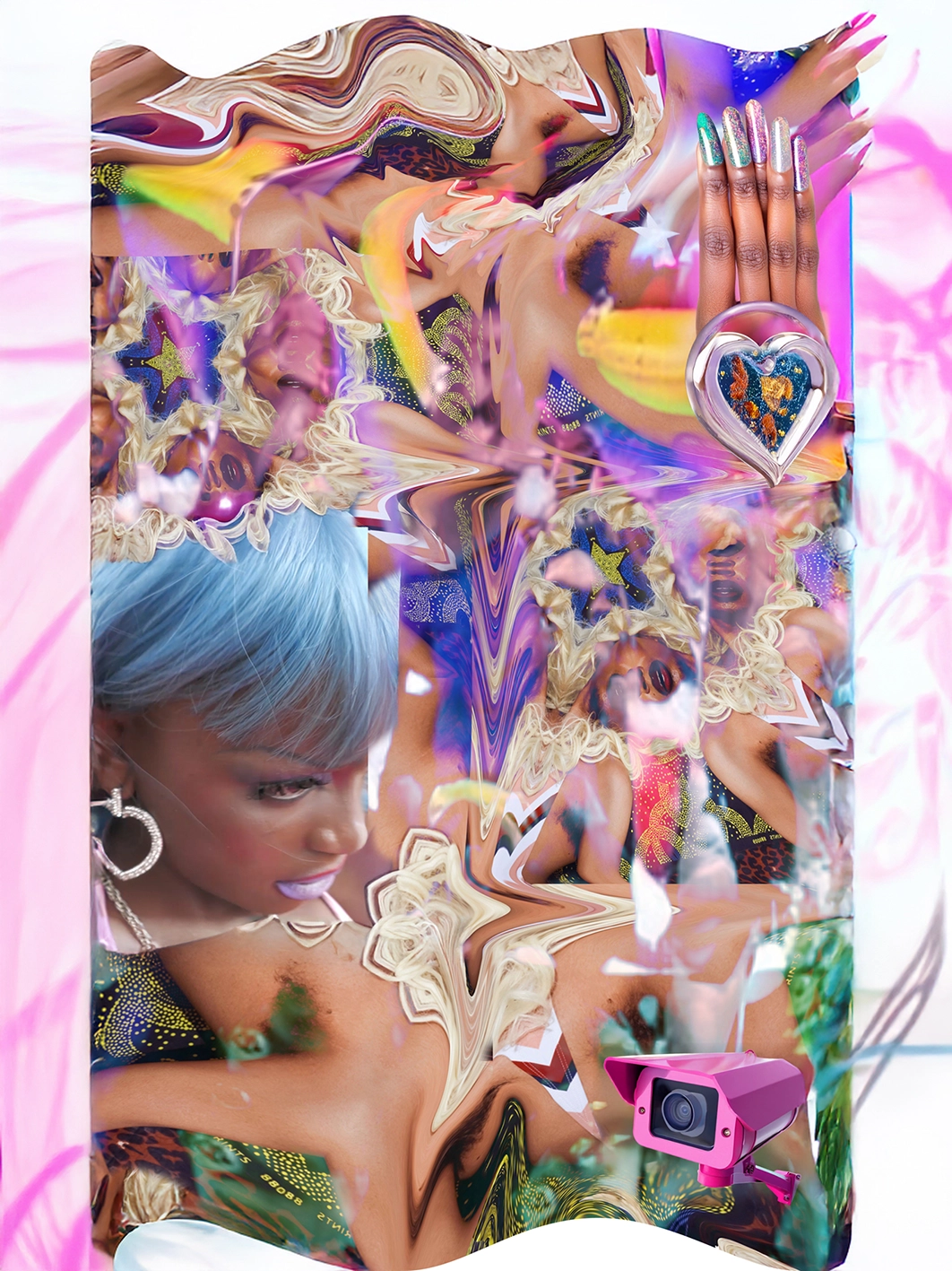
Attribute (2025)

, , ,

Tild Greene trials resilience, achievement and permanence through material reactions. Their practice focuses on the potential for activation, taking use and sentiment as equally moving forces of latent and objectified goods. Their sculptures explore the brink of function, physically challenging systems of (self) evaluation and behavior.

Artist Statement

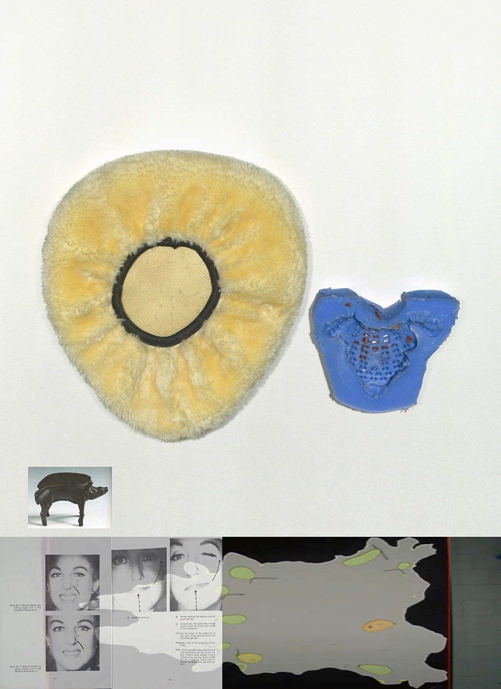
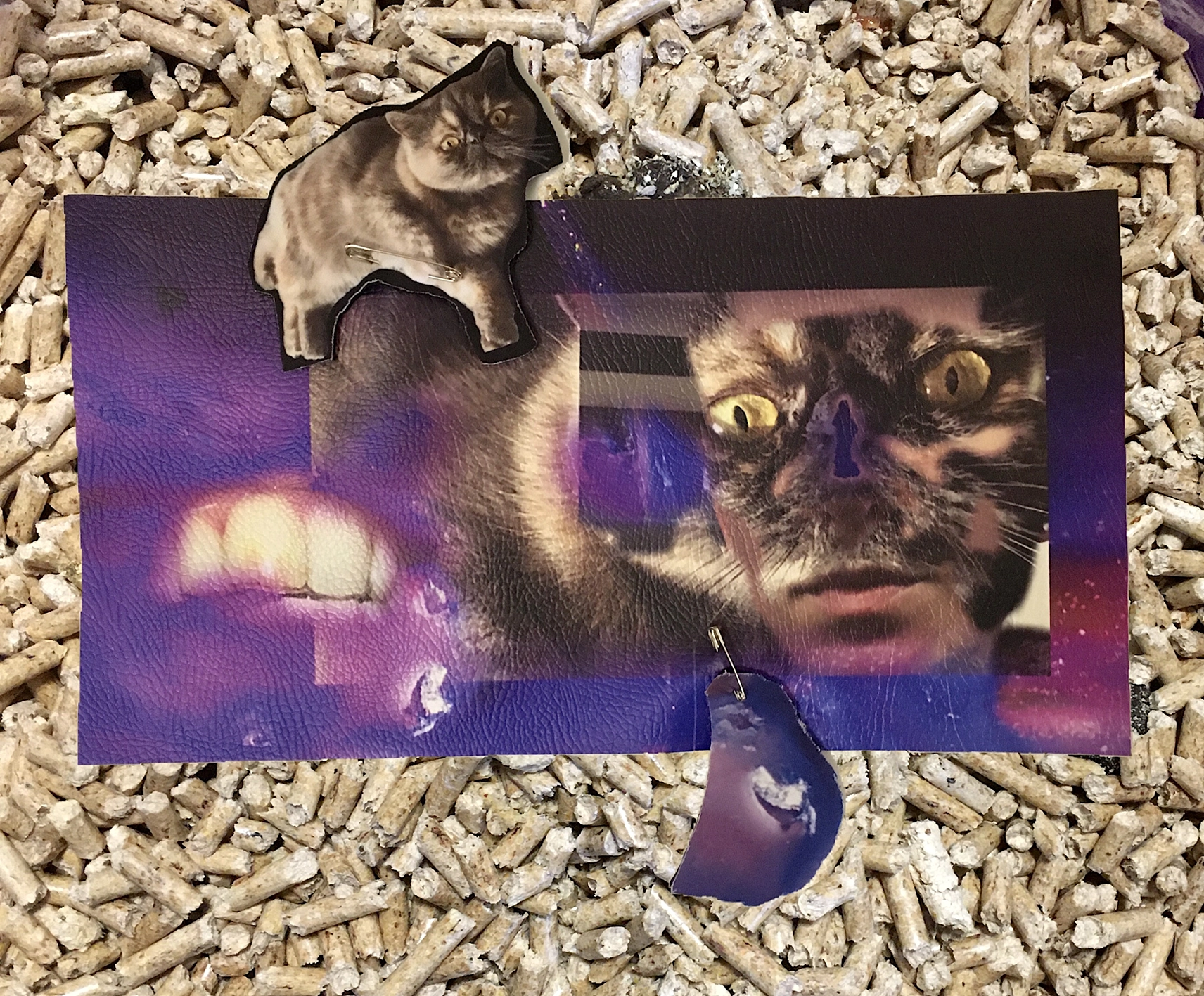
The print combines an unused fluffy bike seat cover, one half of a silicone mold of a body-massager, an image of an Iron Age Celtic bronze boar, scans from a 1970s facial massager manual, and a leather hide mapped by an industrial scanner to register its weakest and strongest points. Together, these materials focus on the potential of skin as both placeholder and barrier, linked to ideas of legacy and performance. The work draws on research into clowning classes—typically attended by those training to become professional clowns, and recommended for actors and performers—which challenge behavioural norms and encourage bolder self-expression through the loosening of conscious control.

Printing & Material

All editions are produced using professional pigment printing technology, ensuring exceptional colour depth, smooth tonal gradations, and long-lasting archival quality. This process delivers museum-standard digital fine art prints with outstanding sharpness, minimal colour shift, and consistent results across both colour and black & white works. Each print is produced under controlled professional conditions to ensure consistency, durability, and fidelity to the artist’s original work.

Each work is produced as a museum-quality fine art pigment print on Hahnemühle Photo Rag® Baryta, digitally signed by the artist and accompanied by a certificate of authenticity, and released in strictly limited editions.

All editions are printed on Hahnemühle Photo Rag® Baryta, one of the most renowned fine art papers in contemporary photographic and digital art practice. This exceptional 315 gsm, 100% cotton paper combines a delicate, tactile surface with a luminous baryta high-gloss finish, offering outstanding depth, precision, and tonal richness.

Widely used by artists, galleries, and museums, Photo Rag® Baryta meets the highest standards for archival fine art printing. The paper is acid-free, OBA-free, and museum-certified, ensuring long-term stability and preservation.

Each edition is produced with professional pigment inks, creating a work that is not only visually powerful, but also conceived as a lasting collectible object — materially, conceptually, and historically.

curated by

CURATOR

Lorenzo Xiques

Lorenzo Xiques: Practice and Context

Lorenzo Xiques (b. 1983, Caracas) is an independent curator operating from Naples, Italy. His practice is characterized by a rigorous inquiry at the intersection of contemporary art, performance studies, and critical social research. Xiques’ professional trajectory began following academic studies in architecture, an experience that informs his structural and spatial understanding of curatorial development. Fundamentally, his curatorial path is shaped by his personal history as an immigrant, arriving from Venezuela to Southern Italy at age eight.
This experience —starting from zero, learning a new language, and assimilating to a different culture without resources or family connections in the arts— is described as his punto di arrivo (point of arrival), profoundly affecting his perspective. From 2013 to 2017, Xiques held the position of Artistic Director at Quartiere Intelligente in Naples, where he established cultural programming focused on the discourse of sustainability and emergent urban practices. His institutional collaborations are significant, including ongoing work with museo Madre, a coordination role at Casa Morra Archivi d’Arte Contemporanea from 2017 to 2018, and for performance art within the Volcano Extravaganza festival (Fiorucci Art Trust) edition 2017 and 2019.
Since 2017, he has collaborated with Galleria Fonti in Naples, promoting young national and international artists focusing on a language and research that explores a poetic conceptualism.

Curatorial Thesis: The Outsider’s Path

As an “outsider” to the closed circuit of the artistic elite, Xiques found alternative paths that allowed him to shape his curatorial voice on his own terms, unburdened by tradition. He conceptualized Instagram as a digital sanctuary that enabled him to bypass geographical, social, and financial barriers, conducting research and building a global community where he could share and communicate art “how I want to.” This “virtual path” transformed professional frustration into an energetic catalyst, providing the possibility to “break through structural barriers.” Xiques’s research concentrates on the investigation of themes relating to gender, identity, and the complex reciprocity between advanced artistic experimentation and models of collective life.

Aesthetic Refusal and Embodied Knowledge

The artists selected for the King Kong Editions collection are united by a shared commitment to creating work that is a direct extension of their personal and political realities. Xiques champions artists who refuse rigid formalism and are often conventionally considered “ugly” for their richness and authenticity. This stance directly challenges the long Italian tradition of arte povera, minimalism, and conceptualism. At the core of this curatorial conceit is the idea that the work is not theoretical but an expression of embodied knowledge, diasporic, and queer methodologies. The artists and their work are “testaments to alternative narratives” and “new imaginaries” that blend the past, present, and future. Recognizing that “contemporary art is a Western language,” Xiques is interested in artists who negotiate the paradox of translating their heritage into a contemporary art code. Like the “diasporic rat” metaphor he cites, the work operates as an imboscata(ambush)—disrupting established art geographies and hierarchies from the edges.

Art as a Gift, Not a Trophy

For Xiques, this Editions project, which includes works by his close friends and collaborators, is not only a natural curatorial fit but also a powerful solution to the inaccessibility he has faced. The collaboration seeks to create tactile bridges between his virtual community and the intimate space of the home. The artists were asked to offer a work that “you would love to gift to a friend,” shifting the relationship from ownership and status to one of personal connection and shared values. Xiques is thinking of the passionate art lover who can’t afford galleries but can, through this project, “buy an art print and have it in their house, be in company with it and feel part of a community.” This collaboration demands active participation, asserting that “There is no space for a neutral artist anymore.” The works are not theoretical or housed “in a vacuum,” but are “our lived experience,” representing an ongoing practice of building a more inclusive, meaningful art ecosystem.


ARTIST

Tild Greene

How does this piece relate to your personal archive or daily observations?

This print is a culmination of recent research recorded through my studio archive. The archive itself—a collection of images, objects, and scans—has always filled the main extent of my workspace. It acts as a framework whenever I begin a new work or idea, allowing me to continually draw connections between materials and references.

For this print, I drew from the archive in several ways: an unused fluffy bike seat cover, one half of a silicone mold of a body massager tool, an image of an Iron Age Celtic bronze boar, scans from a 1970s facial massager instruction book, and a leather hide that has been recorded by an industrial scanner to map areas of its weakest and strongest points.

How do you use imperfection as a texture or technique?

I wouldn’t say I apply imperfection as a deliberate technique; rather it has become somewhat inherent to my way of working. I’ve never been a neat person, so making something that is subjectively ‘perfect’ hasn’t really been in my vocabulary. I find with sculpture, a perfectly executed form can often become the primary impact. What interests me more is the desire for perfection: how it relates to the conditioning of the body, expectations of behaviour, or ideas of suitability.

When working with prefabricated materials, I’m drawn to the visible signs of use and aging. The visible effect of a previous purpose—it has had agency, it has been useful. When carried into a work, it is these qualities that can make it so tangibly relatable.

What decisions were made instinctively, and which ones did you labour over?

The selection process was largely instinctive. The scans of the objects, for example, were taken on a single day with an overhead scanner, pulling together materials that resonated with my thoughts on behaviour and habit. I was drawn to the pairing of the two objects in the print because of their duality, in their silhouettes and the fact that both originally had the capacity to support or hold the body in some way. One object had been used, while the other, still new, held different states of value.

The images were chosen with a similar mindset, using references of practice, legacy, and appearance. I was interested in how each element suggests a negotiation with a desired standard.

The more laborious decisions came during placement and final selection. Testing scales and combinations. The final print ended up being from one of the first drafts, so the instinctive choice carried the strongest charge.

What histories or desires are embedded in these images?

At the time of making this print, I was reading Nuar Alsidir’s book Animal Joy, in which Alsidir writes about participating in clowning classes to examine behavioural conditioning and emotional responses. While these classes are often attended by those training to become professional clowns, they are also recommended for actors and performers more broadly.

This led me to consider both regulation and performance, and the physical self-consciousness that this might produce. I was curious how these dynamics can be reflected within imagery, which led to the references within the print. Together, these elements engage with an assessment of material, whether derived from the body or employed by it, with an attention to how it might be held, improved, or aspired to.

How does queerness shape your gaze and your way of working?

Queerness has sort of continually kept me engaged with subjects of transformation, endurance, and desire within my work—how these forces are inscribed on the body, and how they circulate through structures like the Western “wellness” industry and gendered normativity. I’m interested in the body’s capacity for change, and I draw a parallel with the materials I work with: how they can be pushed or re-formed to arrive at a new state. It is this potential for transformation that sustains my practice.

At the same time, queerness makes me conscious of the contradictions within that process. I’m critical of the pressures embedded in normative culture, but I’m also aware of the ways I sometimes desire or lean into them. It often comes back to belonging, and certain behaviours can act as the gateway for that. Like the ways queer couples sometimes mimic gender roles, there can be a kind of play in adopting or exaggerating those structures, and I also see it as a privilege to be able to do that. The tension between critique and craving doesn’t resolve, but it generates energy.

What do mistakes or accidents reveal in your process?

In general, my work often relies on incidents or mistakes. I like it when this opens possibilities with a material, and it is this stretching of a potential that links to subjects of capability. There is a sort of submission that I adopt between my application and the material, and I have learned that the more receptive I am to this, the more interesting outcomes occur.

What books, films, images do you keep turning to?

The painting Club Night 1907 by George Bellows.
Mike Oldfield’s album cover of Tubular Bells by Trevor Key, 1973.
The film Beau Travail, 1999, by Claire Denis.
Zami: A New Spelling of My Name, 1982, by Audre Lorde.
Feeling and Form, 1953, by Susanne K. Langer.

 

BIOGRAPHY

Recent exhibitions include Galeria Stereo 2023 (Poland); Liste Art Fair 2023 (Basel); Punt WG, Loods6 (2024), Projectspace 38.40 for Amsterdam Art Week and 50L, 2025 (The Netherlands); Una Boccata D’Arte, 2025, Galleria Fonti 2024 (Italy); with upcoming presentation at Oude Kerk for the Warmoestraat Biennale 2026 (The Netherlands) and participation in the Mausmaus International Study Programme in 2027 (Portugal).